Market Share Reporting: 40 Hours → 2 Hours
The Problem
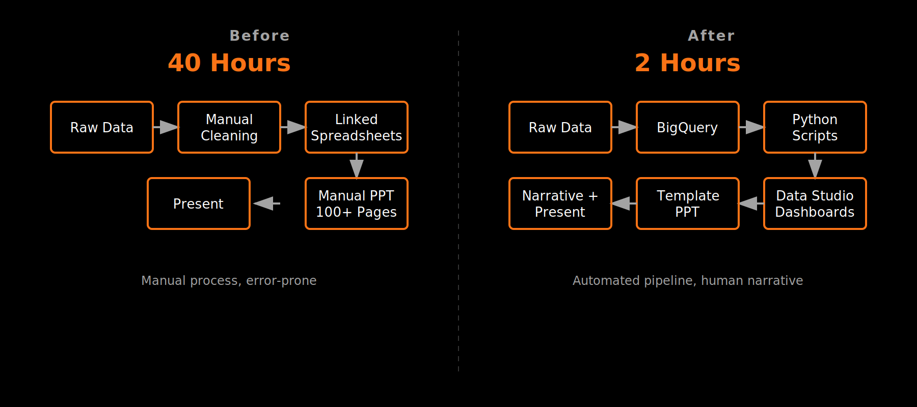
A single analyst spent 40 hours every month on market share reporting—25% of their capacity. The workflow hadn't been updated in years: manually cleaning massive datasets across linked spreadsheets, then building a 100+ page PowerPoint deck for executives. The process worked, but barely.
The Approach
I mapped the full workflow and broke it into stages: data acquisition, storage, cleaning, visualization, and presentation. Each stage had its own bottleneck.
The biggest wins came from infrastructure changes. We moved from spreadsheet-based storage to BigQuery, which ingested 100MB+ CSV files almost instantly—files that previously choked the system. Python scripts replaced manual cleaning, transforming hours of work into minutes. Google Data Studio dashboards replaced static slides for most stakeholders.
The executive team still wanted a PowerPoint. Fine—but now it pulled from clean data and did not take dozens of hours to assemble.
The final change wasn't technical. I built in time each month to identify the narrative: where we grew, where we dropped, what patterns emerged. We'd connect with product teams to understand the why behind the numbers before presenting to leadership.
The Result
40 hours → 2 hours. Most of that remaining time is human work: building the narrative and preparing to answer questions. The data pipeline runs itself.
Tools: BigQuery, Python, Google Data Studio